A Windows Start menü a Windows operációs rendszer központi eleme az 1995-ös debütálása óta. Az évek során jelentős változásokon ment keresztül, amelyek a technológia fejlődését és a felhasználói preferenciák változásait tükrözik. Az alábbiakban áttekintjük, hogyan fejlődött a Start menü a Windows 95-től a Windows 11-ig.
Windows 95: A Start menü születése
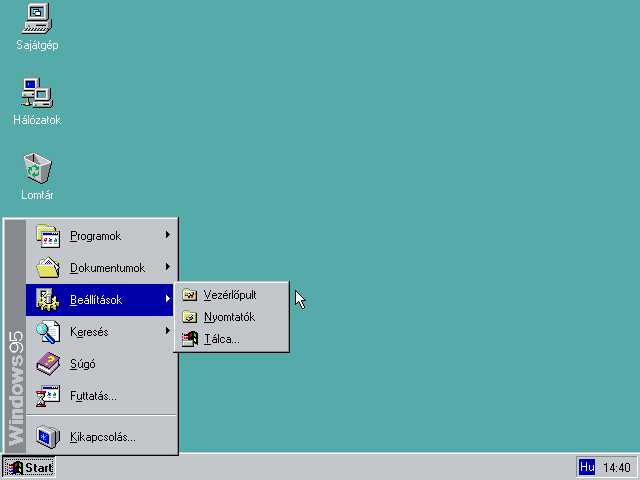
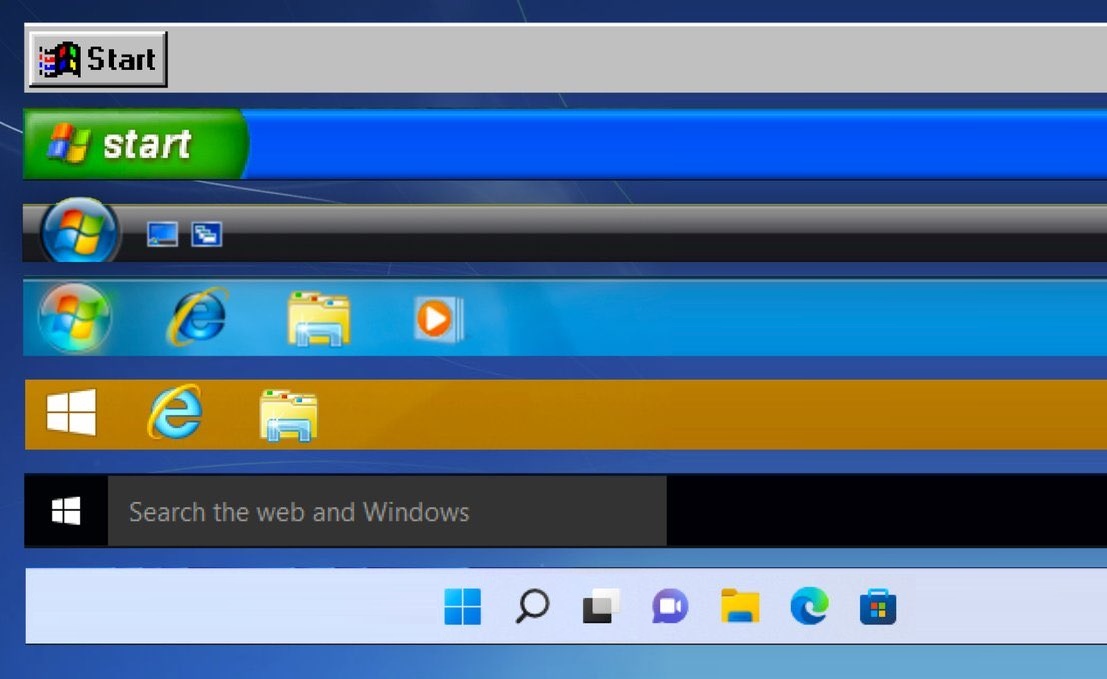
A Windows 95 megjelenésekor ismerte meg a világ a Start menüt, egy forradalmi funkciót, amely az operációs rendszerben való navigációt hivatott kezelhetőbbé tenni. A bal alsó sarokban található Start gomb egy egyszerű menüt nyitott meg, amely a programok, dokumentumok, beállítások és a “Leállítás” opció linkjeit tartalmazta. Ez a kialakítás megalapozta a Start menü minden későbbi változatát.
Windows 98 és Windows ME: Az alapok finomítása
A Windows 98 és az ME a Windows 95 által lefektetett alapokra épített, a Start menü kialakításán és funkcionalitásán végzett kisebb módosításokkal. Ezek a verziók a stabilitás és a használhatóság javítására összpontosítottak, megtartva a Start menü alapvető struktúráját, miközben javították annak érzékenységét és hozzáférhetőségét.
Windows XP: Új paradigma
A 2001-ben megjelent Windows XP egy színesebb és felhasználóbarátabb Start menüt vezetett be. Ez a változat két oszlopot tartalmazott: a bal oldali oszlopban a kitűzött és gyakran használt programok voltak láthatók, míg a jobb oldali oszlopban a mappák, beállítások és rendszerfunkciók gyors elérését biztosította. Ez a kétpólusú kialakítás megkönnyítette a felhasználók számára, hogy gyorsan és hatékonyan megtalálják, amire szükségük van.
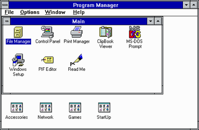
A Start menü megjelenése előtt a Windows 3.11 felhasználói a Programkezelőre támaszkodtak az alkalmazások indításakor. A Programkezelő egy ablakalapú felület volt, ahol a felhasználók kézzel hoztak létre csoportokat és adtak hozzá programikonokat. Minden csoport úgy működött, mint egy mappa, amely különböző alkalmazások parancsikonjait tartalmazta.
Windows Vista és Windows 7: Továbbfejlesztett keresés és esztétika
A Windows Vista jelentős változásokat hozott a Start menüben, különösen a keresőmező beépítését, amely lehetővé tette a felhasználók számára, hogy kulcsszavak beírásával gyorsan megtalálják a fájlokat és alkalmazásokat. Ez a verzió bevezette az Aero néven ismert elegáns, üveges esztétikát is. A Windows 7 megtartotta a Vista számos funkcióját, de javította a teljesítményt és a használhatóságot, a Start menü ezáltal könnyebben navigálhatóvá vált.
Windows 8: Merész változás
A Windows 8 radikális eltérést jelentett a korábbi verziókhoz képest azzal, hogy a Start menüt egy érintőképernyős felületre tervezett, teljes képernyős Start képernyővel váltotta fel. Ez a változás vegyes reakciókat váltott ki, mivel sok felhasználó zavarónak és kevésbé hatékonynak találta az új felületet az asztali használathoz.
Windows 10: A Start menü visszatérése
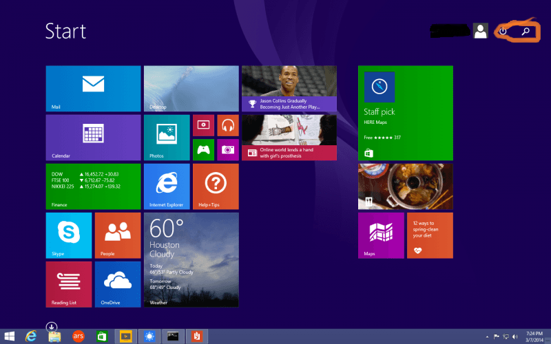
A felhasználói visszajelzésekre reagálva a Windows 10 visszahozta a Start menüt, egyesítve a Windows 7 és 8 legjobb funkcióit. Az új menü egy bal oldali oszlopot tartalmazott hagyományos linkekkel, a jobb oldali oszlop pedig az alkalmazások átméretezhető élő csempéit. Ez a hibrid kialakítás sokoldalú és testreszabható felhasználói élményt biztosított, mind az érintőképernyős, mind a hagyományos asztali felhasználók számára.
Windows 11: Modern frissítés
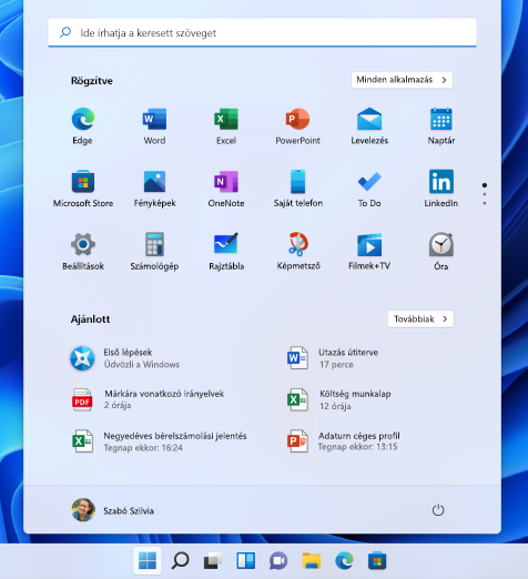
A Windows 11 egy áramvonalasabb és középre helyezett Start menüt vezet be, az egyszerűségre és a könnyű használatra összpontosítva. Az új dizájn eltünteti az élő csempéket a statikus ikonok javára, és keresősávot integrál a tetejére. Ez a letisztult, modern megjelenés illeszkedik a Windows 11 általános esztétikájához, a termelékenységet és a felhasználóbarátságot hangsúlyozza.
A Windows Start menüjének fejlődése a technológia és a felhasználói felület kialakításának szélesebb körű trendjeit tükrözi, folyamatosan alkalmazkodik a felhasználók igényeihez a különböző eszközökön és kontextusokban.
A Start menü a Windows 95-ös szerény kezdetektől a Windows 11 modern, minimalista megközelítéséig a Windows-élmény alapvető eleme maradt.
-
 Windows 10 Home ESD7 990 Ft
 -
 Windows 11 Home9 880 Ft
 -
 Windows 10 Pro ESD11 880 Ft
 -
 Windows 11 Enterprise13 800 Ft
 -
 Windows 10 Pro COA matrica13 990 Ft
 -
 Windows 11 Pro14 990 Ft
 -
 Windows 11 IoT Enterprise LTSC 2024Akciós termék16 890 Ft
 -
 Windows 11 Pro COA matrica ajándék USB telepítővel20 490 Ft
 -
 Windows 11 Pro + Office Standard 2021Akciós termék40 383 Ft
start menü, Start menu, Vista, win10, win11, win7, win89, win95, Windows, windows 10, Windows 8, Windows 98, Windows ME, XP
admin
További cikkek tőle